Cumulative Layout Shift
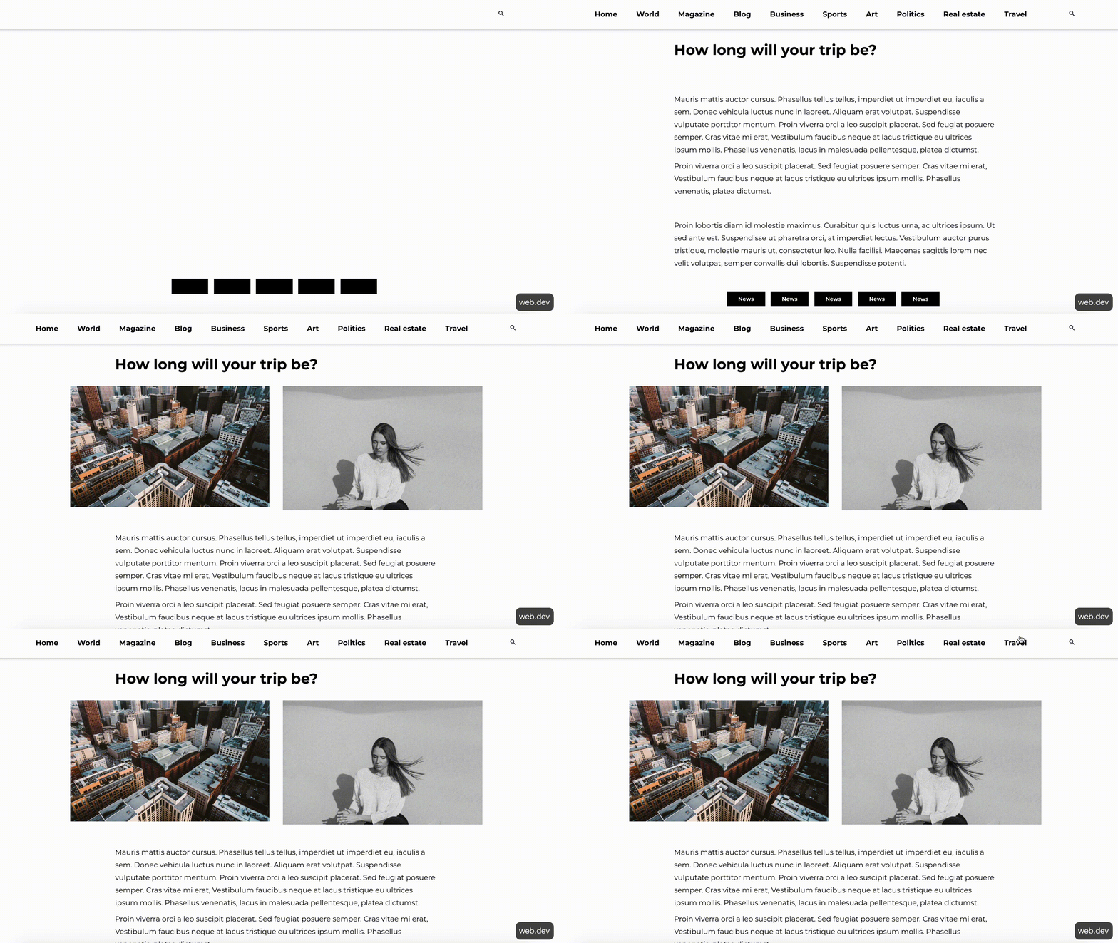
Imagine you’re browsing the web, trying to read an article that’s piqued your interest. Perhaps you’re reading a recap of the latest hit streaming series or catching up on the day’s headlines. You open the page and start reading the content as the rest of the page loads, getting to the end of the opening paragraph, when suddenly an image appears and pushes the text you were in the middle of reading down and off your device’s screen.
Even worse, you were about to click a link to check out another story that sounded interesting and the sudden jump caused you to instead click a button to sign up for a newsletter.
Now you have to go back a page, wait for it to load all over again and then scroll to try to find the link you wanted.
What you just experienced is known as a “layout shift” and it’s the exact issue Google is trying to measure and score using the Core Web Vital metric known as Cumulative Layout Shift.
A Brief Introduction of Cumulative Layout Shift
Cumulative Layout Shift (CLS) is a way to measure and quantify how much various pieces of content (text, images, ads, video, etc.) jumps around as the page loads.
As mentioned above, it’s part of Google’s user experience metrics known as Core Web Vitals, which are a set of metrics designed to measure and evaluate how real-world people experience a page on the web.
A page’s CLS score tells us how visually stable the page is as it loads content visible to the user by measuring and scoring every time a page element (such as text, image, video, ad, etc.) jumps while visible on a user’s screen. Shifts that happen off-screen aren’t visible to users and therefore don’t contribute to CLS.
What is a good CLS score?
Google scores Cumulative Layout Shift on a spectrum of a “Good” to “Poor” experience for users:
- Good: A CLS score of 0.1 or lower
- Needs Improvement: A CLS score between 0.1 and 0.25
- Poor: A CLS score above 0.25

How Cumulative Layout Shift works
Cumulative Layout Shift scoring works by measuring how much every layout shift causes content on a page to move around and adding them all together so you get a score for the entire page (hence “Cumulative” Layout Shift score).
Individual layout shifts are scored by measuring how unstable elements affect what’s visible to users during a layout shift (called the “impact fraction”) as well as how far on the screen an unstable element moves during a shift (called the “distance fraction”).
- Impact fraction: This measurement is the union of the amount of visible space taken up by a page element when it first loads and the amount of space taken up after it shifts.
- Distance fraction: This measurement looks at the greatest distance, relative to screen size, a layout shift causes an element to move on the page.
To get the score for a single layout shift, you just need to multiply the impact fraction by the distance fraction.
Google then assigns a single CLS score for a page by adding together the score for each layout shift detected on the page.
Scenario 1
In the first frame, the page loads a block of text that takes up 25% of the visible page. In the next frame, it loads a second element that takes up 50% of the screen. The union of visible space taken up by the unstable element is 75%, making the impact fraction 0.75. Since the text block moved 50% of the visible screen, the distance fraction is 0.50. Using the formula, the score for this layout shift is 0.375
Scenario 2
In the first frame, the page loads text that takes up 50% of the visible screen. In the next frame, a second element that takes up 25% of the screen is loaded above the text. Between the two frames, the unstable text element takes up 75% of the visible screen, making the impact fraction 0.75. Since the text block moved down 25% of the visible screen, the distance fraction is 0.25, making the total layout score 0.1875.
Scenario 3
In the first frame, the page loads a block of text that is 25% of the visible screen. In the second frame, a second element loads that is also 25% of the visible screen. The union of the space taken up by the text between the two frames is 50%, making the impact fraction 0.50. The text element moves down 25% of the screen so the distance fraction is 0.25 so the score for this layout shift is 0.125.
Scenario 4
In the first frame, the page loads a block of text as well as an image, each taking up 25% of the visible screen’s height. In the second frame, the block of text extends down another 25%, making the union of the elements between the two frames 75%. So the impact fraction is 0.75. However, in this scenario none of the visible elements actually shift from their starting positions, so the distance fraction is 0 which makes the score also 0.
Scenario 5
In our last scenario, the page loads two elements, both taking up 25% of the visible page. In the second frame, the page adds a third element at the top that takes up 25% of the page and expands one element to 50% of the visible screen. All in, the content now takes up 100% of the page so the impact fraction is 1. In this scenario, the unstable element (the text block) was moved by one shift that was 25% of the screen size and another shift that’s 50% of the screen. Because distance fraction is based on the largest shift, the distance fraction for this shift is 0.50, making the score for this shift also 0.50.
Result
If all of these shifts happened when loading one page for a user, the Cumulative Layout Shift score for this page would be 1.1875, putting well beyond the threshold to be considered a “poor” experience for users.
Ouch.
These scenarios highlight a few key points to keep in mind about how scoring layout shifts work:
- Seemingly small differences in what changes between frames can have large impacts on the score.
- It’s better to have large elements that shift very little than to have smaller elements that shift a lot (obviously, elements that don’t shift at all is best).
- Not all visible shifts contribute to CLS. Leaving space for new elements to load allows you to add new content elements to a page without negatively impacting user experience or CLS.
What You Need to Know About CLS to Improve Your Website (with Real-World Examples!)
As we noted above, not all layout shifts are inherently bad or will negatively impact CLS scores. In fact, as we saw in the hypothetical scenarios above, it’s perfectly possible to load content elements in the visible screen from frame to frame without causing existing content to jump around.
It’s also possible to use layout shifts in such a way as to create expected shifts:
- Expected shifts: Layout changes after interaction from the user (click button, typing in a search field, etc.). Expected layout shifts don’t contribute to CLS.
- Unexpected: Shifts that happen abruptly and without engagement from the users (that don’t shift at all is best).

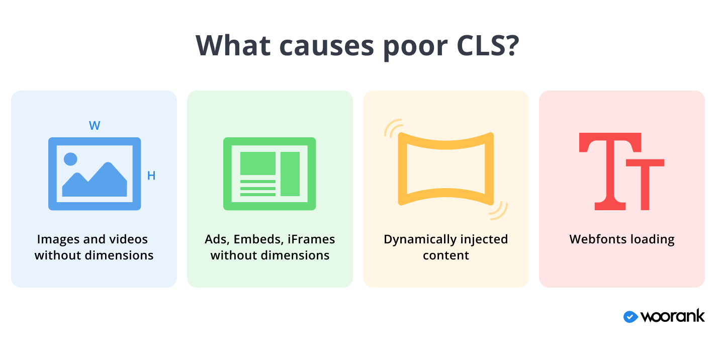
Reserve space for images by specifying dimensions in <img> tag or using CSS. Doing so allows browsers to reserve space for these images as they load the rest of the page
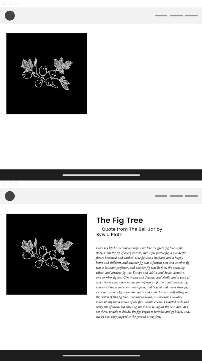
Loading images without specifying their dimensions in the code means browsers don’t know how big they’ll be until they start to load an image, so they need to shift content around to make room for them.

Specifying height and width values for images in the page code allows browsers to reserve space for them and not have to move content around when displaying images.

Avoid putting ads at the top of a page. Consider reserving space for ads using the largest possible ad slot.
Ad networks and publishers often show ads in multiple sizes based on which ad they want to show in a particular moment. Unfortunately, this means the dimensions for an ad slot aren’t set until after the page starts to load.


Like with images, you can specify dimensions for ads in your page code, which allows browsers to reserve space for them when rendering the page. Use the dimensions for the largest ad size you allow on your site to make sure all possible ads can load without distortion.


To keep in mind: Some sites will collapse (hide) an ad slot if an ad fails to load (to avoid blank white space). Because this action will happen after other content loads it will cause CLS problems. Avoid this practice to reduce CLS score.
Don’t insert dynamic content above existing content unless it’s in response to an interaction from the user. If it needs to be at the top, reserve space for it using a placeholder with set height and width to prevent unexpected shifts.
Dynamic content is common across the web and often comes in the form of CTA buttons, banners, “related article” widgets, GDPR/privacy policy notices, newsletter signup forms, etc. By it’s very nature, dynamic content doesn’t necessarily know the dimensions of what it will load until the browser downloads it. This leads to poorer CLS scores when the browser renders the content.

Your best solution is to load dynamic content off screen - so it doesn’t cause layout shifts - or at the bottom of the screen so it doesn’t shift other visible elements.
Use standard (aka “web-safe”) fonts that all modern browsers know how to read. If you need to use a custom font, preload the font to prevent flashes of text or shifting layouts.
When you use a custom font on your site, a user’s browser has to download that font before it can display the text. This causes what is known as a “flash of invisible text” (FOIT) - when the browser renders invisible text until it’s able to display the custom font.

A browser may decide to load text in a standard font until it has downloaded the custom one, causing what’s known as a “flash of unstyled text” (FOUT).

Use the rel=”preload” attribute in the HTML tag containing the link to your custom font. This attribute tells browsers to download the font before it starts showing any text.
Check for CLS Issues on Your Website
Finding and addressing the causes of Cumulative Layout Shift issues on your pages is critical to providing your users with a “delightful” experience when visiting your website. Few things frustrate users and cause them to abandon a page more than when content shifts and jumps abruptly and unexpectedly.
Plus, with Core Web Vitals (and therefore CLS) becoming a ranking factor in Google’s algorithm, scoring a Good CLS can help your site appear higher in search results.
The WooRank Assistant helps identify issues on a page-by-page basis and has recently been updated to include the three CWV checks, helping you to ensure your users have a great on-page experience.


